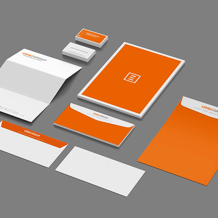

Uribe Group Corporate Identity
Our Task Was
PF Solutions as consulted by Uribe Group on how to make this real estate company stand out amongst all the other local real estate company.
Result
We first got a look at the logo developed by Uribe Group and saw that the colors were orange and gray with a modern distinct font. Orange was a great vibrant color that make for a unique package.
Conclusion
Uribe Group pleased with the bold approach. The branded look has a clean, crisp appeal that stands out above all competitors in the South Florida market. The distinct look will be applied to other marketing materials being developed.
Process
- PMS 1505 Orange, PMS Cool Gray 8
- Custom converted flood back Envelopes and Letterhead
- Bright White Accent Paper
